Component lookbook
Build around the message, not the grid
Clodsite turns a constrained, reviewable YAML plan into a polished informational website. This lookbook shows the choices available today and how each one adapts across the built-in themes.
- type: hero
eyebrow: Component lookbook
heading: Build around the message, not the grid
markdown: |
Clodsite turns a constrained YAML plan into a polished site.
actions:
- { label: See heroes and actions, href: /heroes-actions/, style: primary }
- { label: View Clodsite on GitHub, href: https://github.com/nopolabs/clodsite, style: secondary }
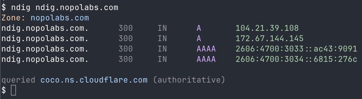
image:
src: /assets/lookbook-hero.jpg
alt: Terminal output from a command-line project
image_position: right
The catalog at a glance
- Catalog components
- 11
- Six goal-oriented and five foundational components.
- Built-in themes
- 3
- Minimal, professional, and bold.
- Reviewable plan
- 1
- Content, structure, metadata, and behavior in YAML.
- type: key-facts
  heading: The catalog at a glance
  items:
    - { value: "11", label: Catalog components }
    - { value: "3", label: Built-in themes }
    - { value: "1", label: Reviewable plan }

A small system with a clear boundary
Clodsite leaves creative exploration to people and capable agents, then captures the agreed result in a deterministic build plan. The component catalog provides enough visual hierarchy to communicate clearly without becoming a general-purpose page-layout language.
Follow the Clodsite project
Read the evolving product story, inspect the source, and see what a build-plan-first workflow can make.
- type: call-to-action
  heading: Follow the Clodsite project
  markdown: Read the product story and inspect the source.
  actions:
    - { label: Visit clodsite.com, href: https://clodsite.com, style: primary }
    - { label: Browse the repository, href: https://github.com/nopolabs/clodsite, style: secondary }
  emphasis: strong